Archives > Graphic Design > Lessons From Paris Album
Lessons From Paris Album
Music Album Design | 2012
In all the projects I worked on in school, it's interesting that this particular one stood out as the only album or CD design project. I created a fictional album called "Lessons from Paris" for a band named Hybrid Moments, inspired by the Misfits song title. Since it was a fictional project, I had the freedom to develop the branding and style for the album.
The theme of the album revolved around romance and the complexities of relationships. I aimed to create a dynamic album design that would change as you opened the product. My inspirations for this project included punk, pop punk, graffiti, as well as art influences from artists like Gustav Klimt, Surrealists, and H.R. Giger.
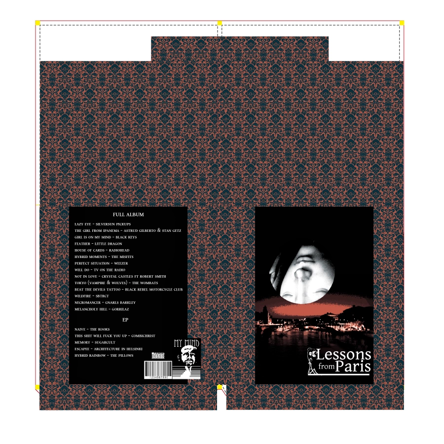
The front cover sleeve had a traditional and romantic feel, featuring a floral motif wallpaper with a moonlit scene of Paris as the centerpiece. The moon was created using a cropped cutout circle with an upside-down Madonna's face on the layer below. However, when you slide the album out, it dramatically transformed into loud and chaotic graffiti punk-style designs. The cracked and worn Madonna's face was revealed, with two sets of eyes giving her a more alien appearance. The only legible text was the band name "Hybrid Moments" on the front, with the song listings on the back.
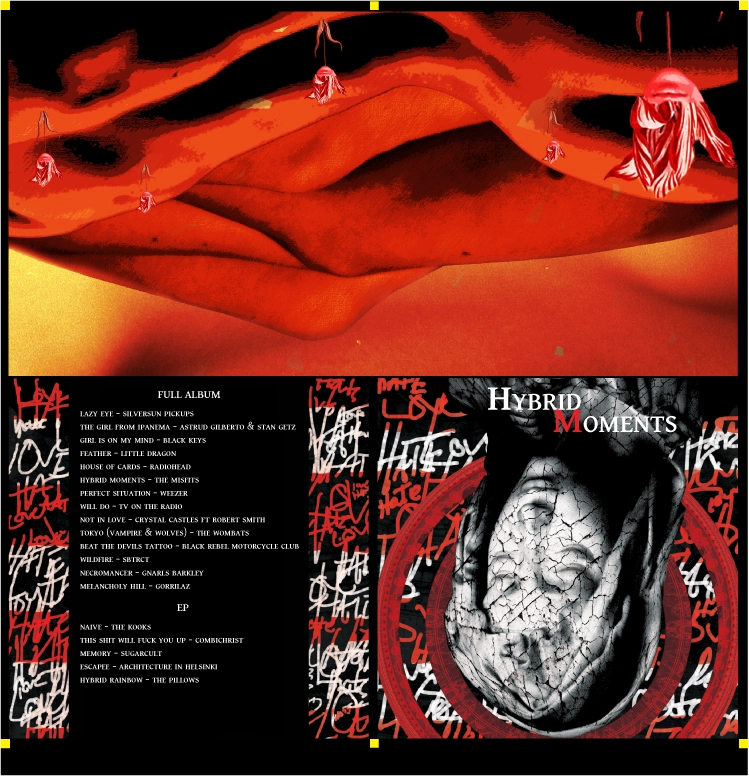
Upon opening the CD, the inside revealed an abstract landscape composed of close-ups of folded body parts such as legs, arms, backs, and torsos of different individuals. Among the landscape, human faces formed flowers. The landscape was created in multiple layers, allowing the foreground to be transformed into a pocket to hold the solid black CD orbs, completing the composition.
The underlying commentary I wanted to convey with this design was the tumultuous nature of love and relationships. It incorporated traditional elements mixed with raw emotions and passions. Above all, I aimed for the design to be strange and memorable if you were to come across it in a store.
Inside CD design and inner design upsidedown (It is meant to be folded).
The outside jacket template that was folded.
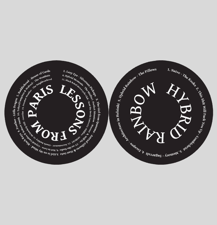
The physical CD designs and fonts.
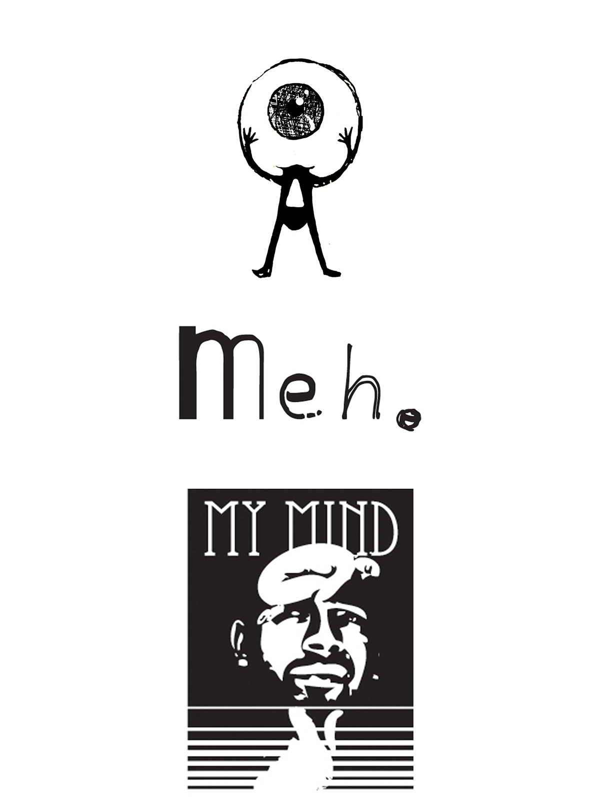
During the design process, I came up with three different fake production studio logos. The first logo was an "AO" logo, representing my initials, with a skateboard park theme. The second logo was for "meh. studios," which was an idea for a company name. Lastly, I decided to use "My Mind" as the name for the studio, inspired by the Black Keys song "Girl is on my mind," and created a logo based on that concept.