My Role:
- Visual & Interactive Design
- User Research & Competitive Audits
- Wireframing & Prototyping
Client:
- None - Google UX Design Certification
Project Duration:
- Feb 2023 - Mar 2023
Link to FIGMA Protoype:
About:
The Blossom & Bloom floral website was the second project I designed while completing the Google UX Design Certification. As with my first project, and to reduce personal bias, I used a project randomizer to simulate a client approaching me with a project. This left me with the prompt to design a commercial website for a floral company. Right away, I liked the idea because I wanted to create a unique floral website that would stand out from the typical color schemes seen in other floral websites. After months of designing a BBQ restaurant app, I was also looking forward to a more delicate project.
Challenges:
In this project, the main challenge was to conceive an impactful website/shop in line with contemporary market standards, emphasizing organization and design to optimize the shopping experience. Unlike my previous project, the primary focus here was on sales, aiming to create a product that could effectively enhance fictional client sales. The Figma prototype featured multiple pages with clickable products, demanding seamless navigation through the shopping pipeline to drive successful sales. The research phase involved a detailed analysis of various product-oriented websites, pinpointing common elements that facilitate customer navigation and purchases.
Step 0. Establishing the Goal
Scroll down to view Blossom & Bloom workflow process.
The Google UX certification course employed a project prompt generator, assigning random design projects. What I enjoyed most about being assigned a random problem was the removal of preconceived ideas about solutions. When tasked with a website for a florist, I dove in to understand potential user problems, conducted research, and practiced empathy to address concerns. This approach helped me think of solutions and establish a focused goal for the project.
The Users' Problems:
- Customers who are unsure of what they want may find ordering arrangements challenging.
- Customers are concerned about whether flowers ordered online will look the same in person and arrive in good condition.
- Florists deal with a diverse consumer base and need to be accessible to everyone.
By identifying these three key problems that users were facing, I set out to create a goal for my upcoming design solutions, aiming to better serve their needs.
The Project's Goal:
Create a website and branding for Blossom & Bloom that prioritizes accessibility, allowing a diverse range of customers to easily customize and order flowers.
After defining the goal and gaining clarity on what I was designing, I dove into the research phase to tackle that goal. The Google UX course stressed the value of empathy and in-depth user research, underscoring the importance of prioritizing users' needs and requirements over personal assumptions.

Step 1. User Research
Scroll down to view continue with research phase.
Background:
In the research phase for Blossom & Bloom, two crucial questions guided my approach. Firstly, understanding the target audience was key, and I gathered insights from sources like safnow.org and petalrepublic.com. With 79% of floral sales coming from women, 63% buying for themselves (33% for fresh flowers), and major sales occurring around holidays like Valentine's Day, Christmas, Hanukkah, and Mother's Day, it was clear that the audience was diverse. To create personas, I targeted Americans who represented the largest worldwide market and focused my attention on the consumers who made up the 30% of sales occurring outside major holidays, catering to devoted year-round flower buyers.
While it may seem counterintuitive, I chose to focus on the smaller group of devoted year-round flower buyers, believing that by meeting their expectations, the design solutions would naturally extend to also cater to the more casual holiday shoppers.
The second question delved into e-commerce design strategies to boost sales. This remained in the background as I conducted a competitive audit, examining various e-commerce websites in the floral, makeup, jewelry, and clothing industries to glean insights into effective design approaches. After this background research, I then began considering pain points users of this website might encounter.
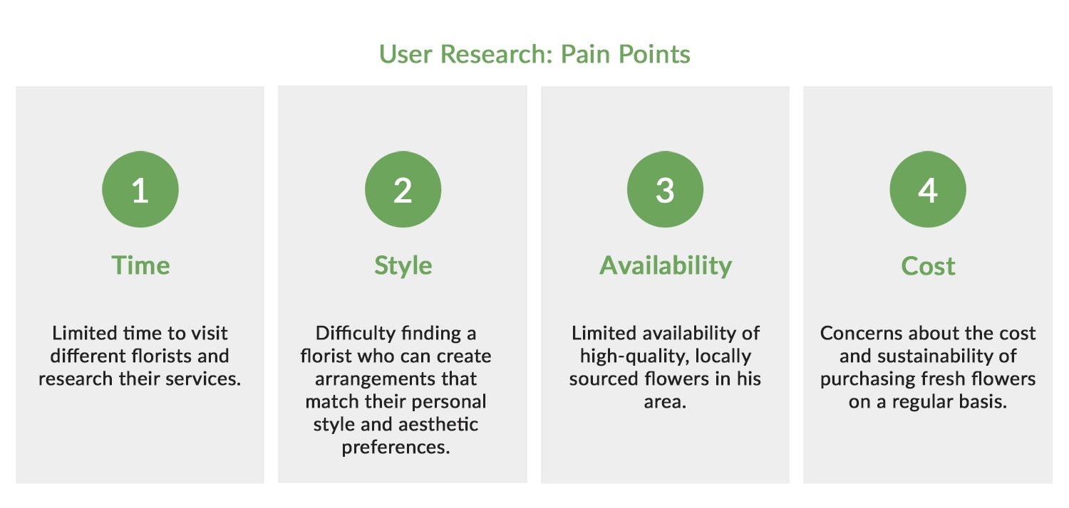
User Research: Pain Points
The next step was interviewing and empathizing with potential users to uncover their pain points. The goal was to better understand the challenges they might face. Operating without a budget, I drew from personal experiences and gathered input from family and friends. Additionally, I explored analogous floral, jewelry, and makeup websites, envisioning potential user frustrations. Building on these observations, I extracted the following insights.
- Time - The process of selecting and purchasing flowers should be streamlined and efficient, providing essential information about shipping, prices, care, etc., to save time for users.
- Style - Customers should easily find styles of flower arrangements they like and discover similar products for future reference.
- Availability - The company should be able to locally source flowers and efficiently ship them to customers anywhere.
- Cost - Explore potential subscription options or pricing plans for multiple arrangement orders.
With potential pain points identified, I could now create more realistic personas and consider the problems they might encounter while interacting with the application.
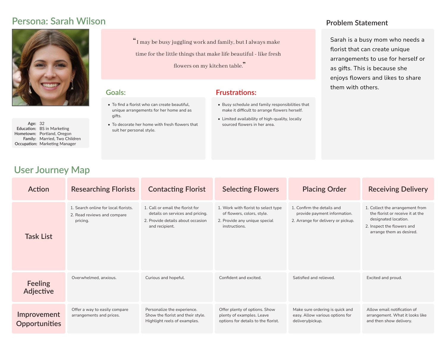
Personas and Journey Maps
Sarah and Michael were created to represent Blossom & Bloom's regular customers. Sarah, a busy marketing manager and mother, wanted a florist that could create unique arrangements for herself or as gifts. She has a personal style and likes to share that with others. Michael, a software engineer, liked simple, modern arrangements as décor throughout the year. Subsequently, I began the process of mapping their hypothetical journey through my application, reflecting on the pain points I had established. This journey mapping aimed to uncover insights and develop solutions to address the problems that my website could alleviate for Sarah and Michael along their user journeys.
Sarah's User Journey - Sarah's journey provided insights into humanizing the florists and enabling them to highlight their styles. Also, to have email notifications that show the arrangement's location and inform the user when it was delivered to the recipient.
Michael's User Journey - Mapping Michael's journey provided insights into having a subscription model, allowing users to provide examples of arrangements, and enabling changes to the delivery schedule.
Armed with these personas and the insights derived from their concerns, I began the design process.
Step 2. Starting the Design
Scroll down to view the design process.
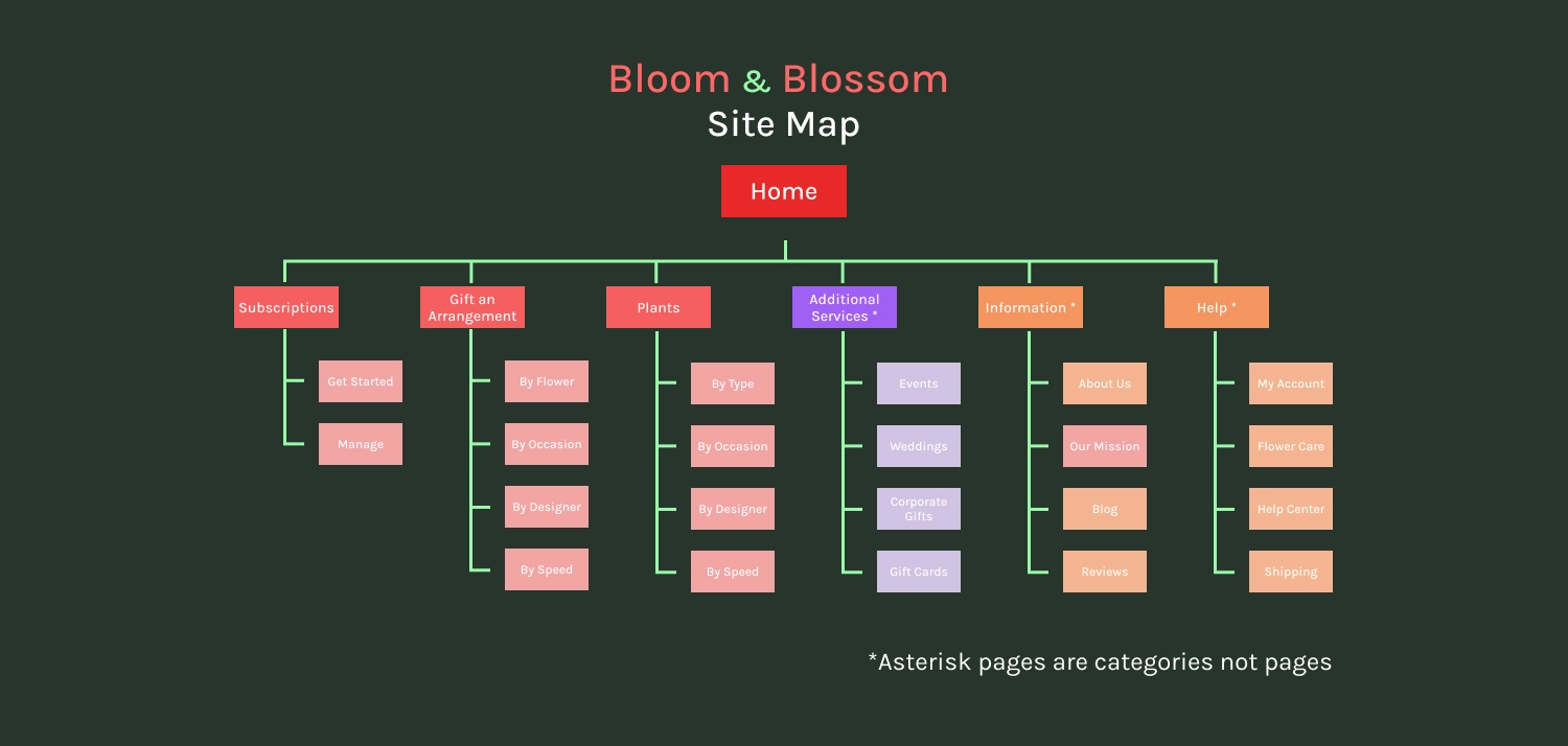
Site Map
With the background research already performed, I was able to quickly complete the site map for Blossom & Bloom's website after the competitive audit gave me ideas for the types of pages floral websites used and their flow. The map is broken down into pages and categories of pages:
Home: Main page with a splash screen introducing customers to Blossom & Bloom. Contains sample sections that reference pages throughout the rest of the website and can be altered for holidays and sales.
Subscriptions: The subscriptions page, the first product page, focuses on offering weekly, monthly, or custom plans, allowing customers to pick arrangements on a recurring basis.
Gift an Arrangement: The main product page filters the floral arrangements offered by Blossom & Bloom. It can display all arrangements or filter based on categories.
Plants: Given that house plants accounted for 20% of sales, I believed that including a separate page for filtering plant arrangements would be useful.
Additional Services: This category represented pages for other sources of income for the website, such as Events, Weddings, Corporate Gifts, Gift Cards, etc.
Information: This category initially represented information about the company, its florists, blogs, or news. Eventually, it morphed into the 'Meet Our Designers' page, which also featured products for customers to buy.
Help: This category represented customer accounts, information on flower and plant care, a help center, and shipping information/help.
With the site map created, I identified the pages that needed to be designed, allowing me to begin with some paper wireframes.
Paper Wireframes
One of the main observations from my competitive audit was that e-commerce websites emphasized clean, simple grids, relying on high-quality images to sell products. I also considered alternating sections, featuring a product row followed by additional sections to visually break up the layout. Additionally, I incorporated an accessibility button on the left side of the screen, a feature I found effective on several websites.
After sketching out a few page layouts on paper, I felt comfortable transitioning to Figma to start working on digital wireframes.
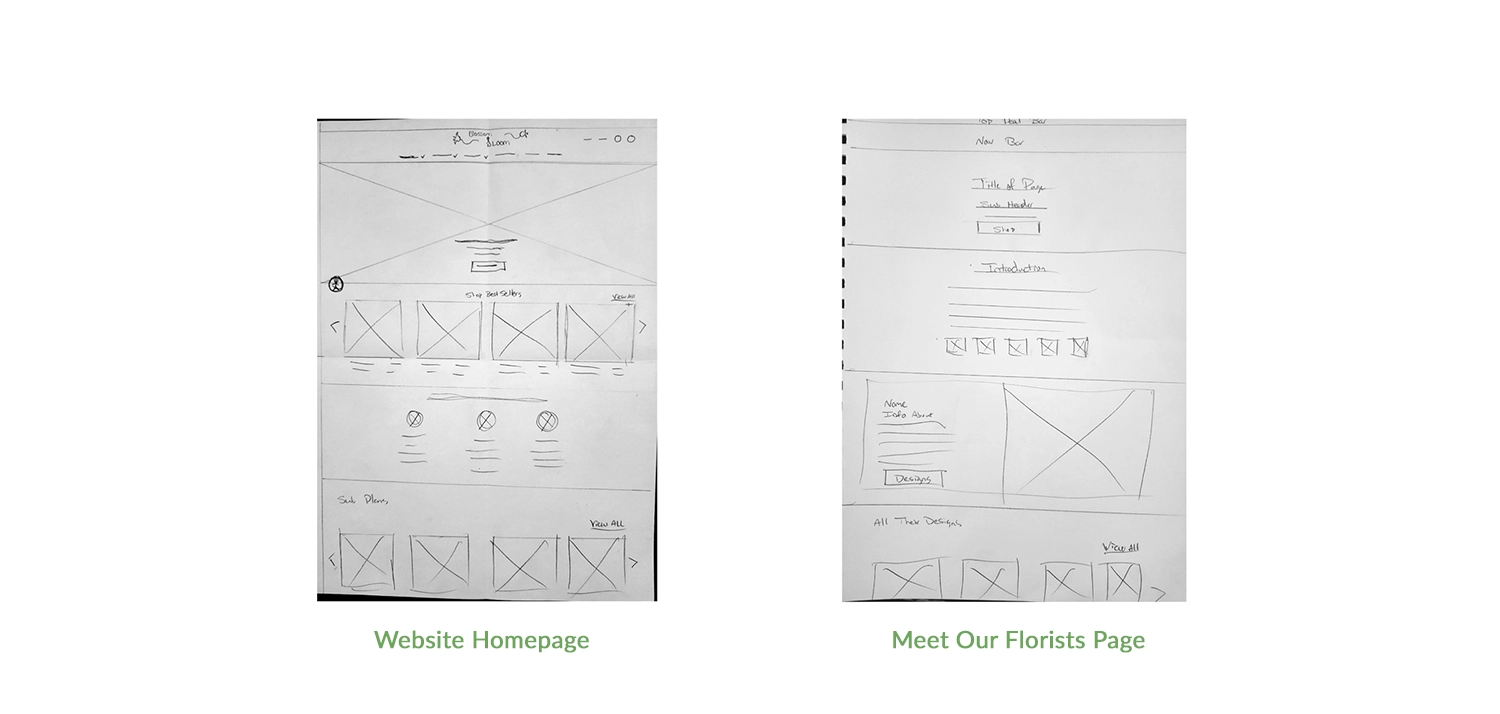
Digital Wireframe - Homepage
The first digital wireframe for Blossom & Bloom shows how little changed compared to the final version. Having each section of the page being the same size allowed pages to be built quickly by snapping them together, depending on what information I wanted to display. I settled on a 4-item carousel because I felt it was the best balance of image size for the number of items to be displayed on the screen.
Digital Wireframe - Meet Our Florists
This is the 'Meet Our Florists' page, which functions as a highlight reel for the designers working for Blossom & Bloom and links to their work for people that like the idea of connecting with someone’s particular style of arrangement. Especially useful for subscription models. Similar to the Homepage, this page alternates between information about a florist and then links to their products.
With wireframes done for most of the main pages of the website, I then began the process of using Figma to connect all of the pages to create a functional prototype.
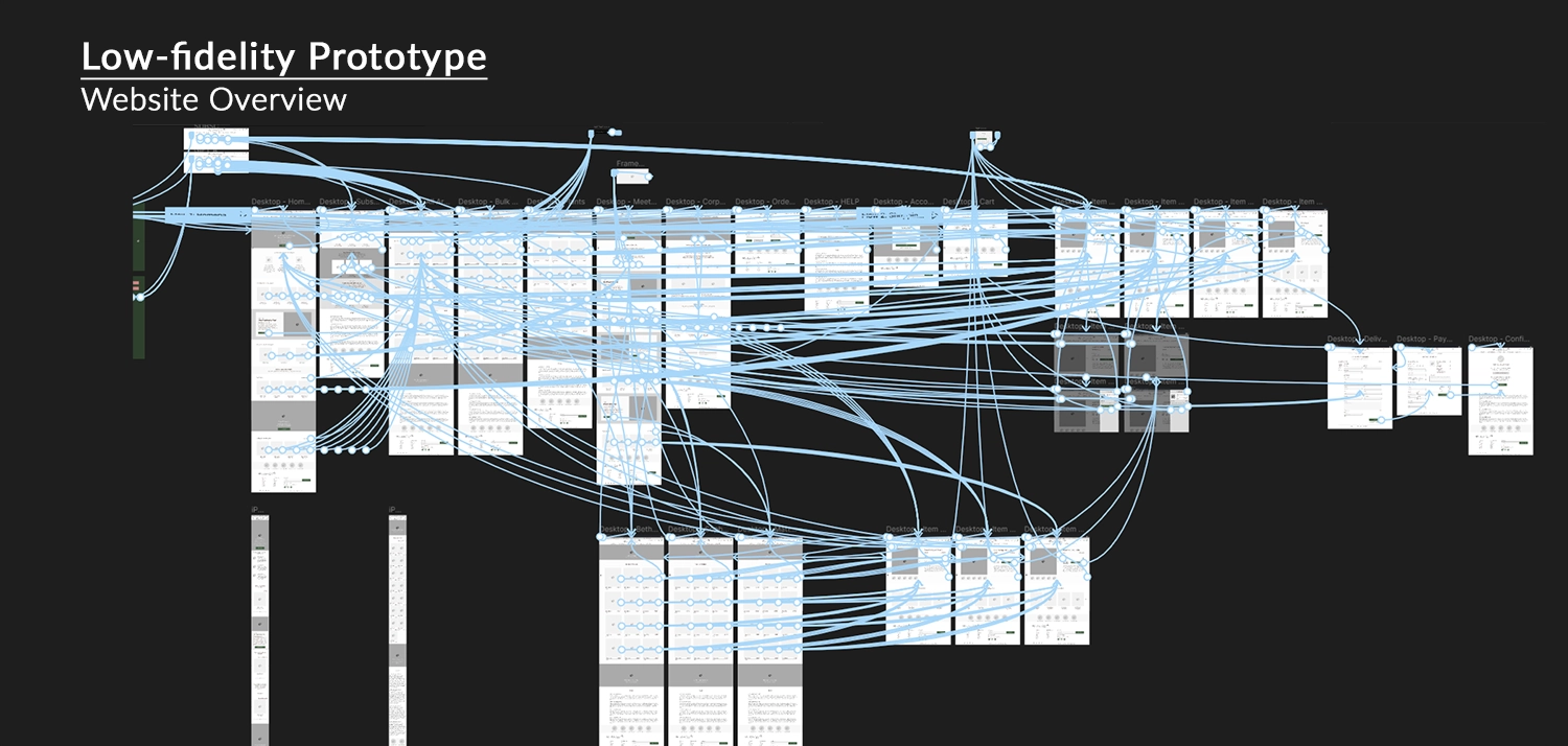
Figma Link: Blossom & Bloom Lo-Fi Prototype
As seen in the image above, the Blossom & Bloom website in Figma evolved into a comprehensive project with numerous interconnected pages. The primary objective was to enable users to choose an arrangement, proceed through the checkout seamlessly, and explore various layouts. While striving for a fully developed website, I ensured a user-friendly experience with a great navigation menu and a well-organized flow. Whether users scroll from the homepage, select an arrangement page, or navigate through specific pages, they eventually reach an item product page leading them to the checkout process.
I'll highlight two specific pages below:
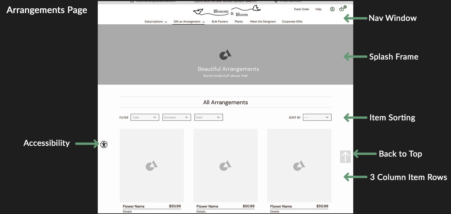
Highlight - Arrangement Page
This is the All Arrangements page, the primary product sorting page for the website. It serves as a dynamic database of all their products with a functioning filter system in the real website. The navigation window and other pages are essentially redesigned and more user-friendly ways to assist users in utilizing this filter window to find the products they are looking for. In contrast to the product carousels, which use a 4-item row, this page increases the row size to display 3 larger items, aiding users in better visualizing the products. This layout is effective as users can vertically scroll and view all the items with the selected filter.
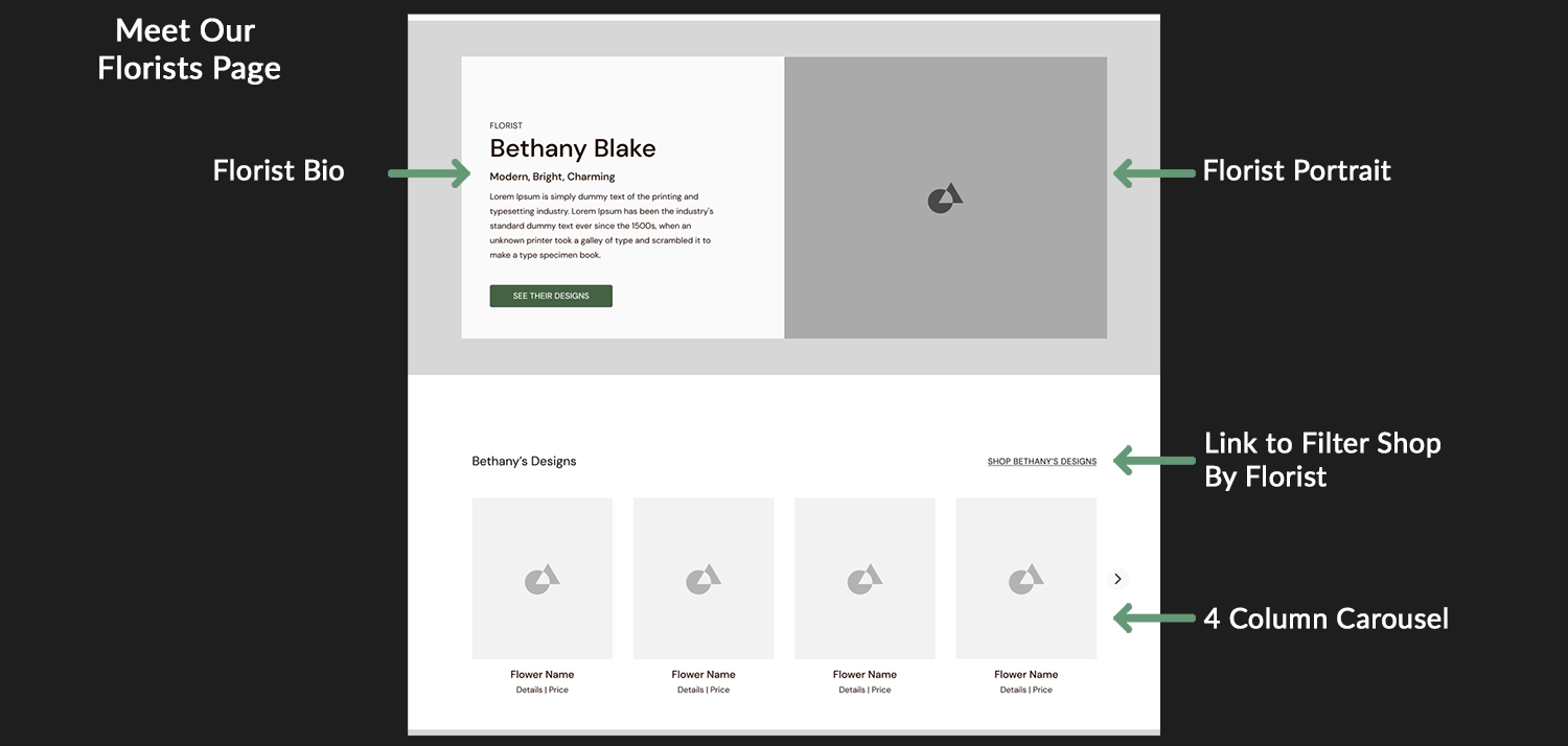
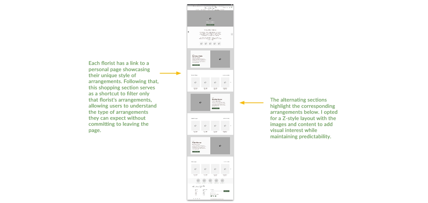
Highlight - Meet Our Florists
This is a close-up of the 'Meet Our Florists' page. At the top, you can see the Florist bio template, providing space for basic information about the particular florist and their arrangement style, along with room for a friendly photo. The bio includes a button linking to their main design page, showcasing all the arrangements they have created for Blossom & Bloom. The lower section features a specific item carousel for that florist, offering a quicker view of their arrangements without navigating to their specific page.
With the prototype built, I could begin a usability study with real users. Observations and notes from this study looked to identify areas for improvement, enhance positive user experiences, and ensure successful completion of website activities.
Usability Study: Findings
The Google UX Course highlighted the importance of usability testing, both from ideal scenarios and real-world constraints such as limited budgets and time. Applying practical insights from the course, I conducted remote usability testing using scripts and questions to guide participants through tasks. This approach recorded user interactions, comments, and feedback, informing my future design iterations.
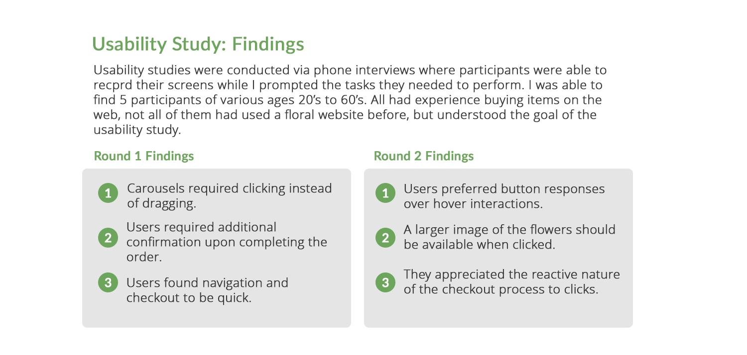
While working on Blossom & Bloom's design, I conducted two rounds of usability testing, focusing on one goal: finding a product or subscription to purchase and completing the checkout process.
In the lo-fi version, primary concerns were related to difficulties in using the drag feature for item carousels, particularly for mobile users. This was addressed by implementing a more sophisticated component table with multiple states. Another issue raised was the need for more confirmation on successfully completing an order. Users appreciated the quick checkout process and liked the Figma interactions representing the checkout procedure.
After building the hi-fi version, the second round of usability testing provided insights into adding a color change to buttons when a user hovered over them. Additionally, it suggested the idea of displaying larger versions of arrangements as an overlay upon clicking on a picture on the items page. These were quick fixes but nonetheless important aspects that I had overlooked during the development of this extensive website.
Let's transition to the next section, where I incorporate Hi-Fi elements and integrate insights gathered from my usability study.
Step 3. Refining the Design
Scroll down to view the refinement of the design.
Creating a Style Sheet
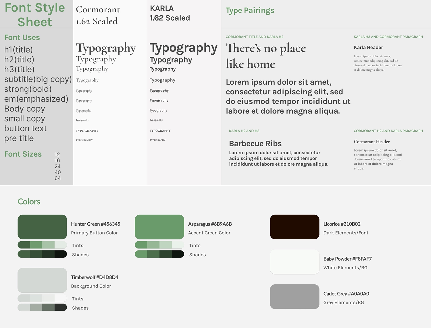
One of the processes I learned while working with Figma was the easy creation of style and sticker sheets when designing for a project. This was a great way to keep track of the various fonts, sizes, and colors used, not only if you're a designer working alone but, more importantly, when you're working with developers so that everyone is on the same page for what the project looks like.
Blossom & Bloom was a departure from my other two projects as I opted for a serif and sans-serif pairing. For the website, I chose the serif font Cormorant for its stylish yet legible qualities, resembling Garamond, and paired it with the sans-serif font Karla, known for its readability and quirky style. Employing the 1.62 (golden ratio) font scaling, which I find effective for web design, ensured visual harmony
In terms of theme, I aimed for a more serious and modern interpretation of a floral website. Many floral websites seem outdated with over-the-top colors and patterns. To create a distinct look, I pursued a monochromatic feel, with green as the primary color. The deep Hunter Green #456345, used for the logo, buttons, and focal points, set the tone. Asparagus Green #6B9A6B added vibrancy, while Timberwolf #D4D8D4, a green-grey, served as a backdrop alternating with white. Avoiding solid black, I opted for Licorice #210B02 as a dark yet warm color for Blossom & Bloom.
With the established theme and created hi-fidelity elements, let's showcase some designs following the second round of usability testing.
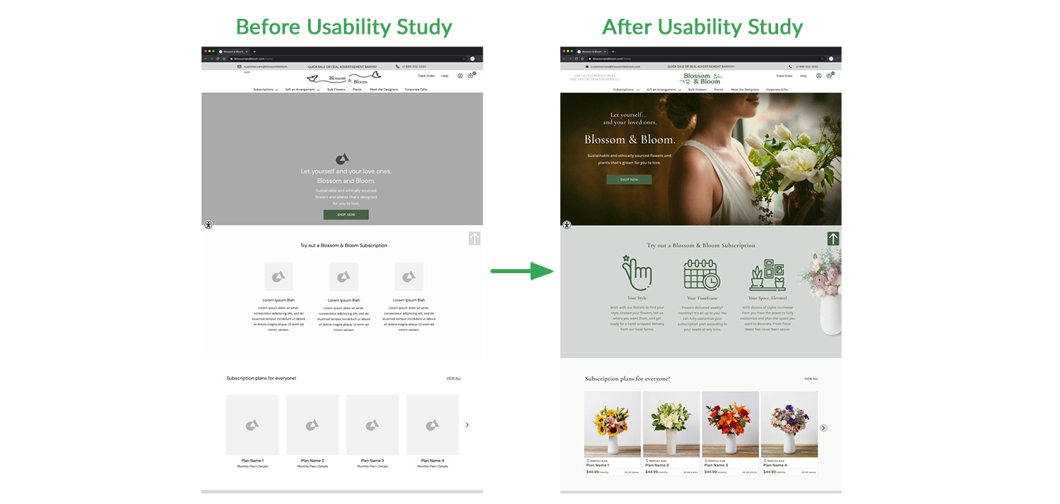
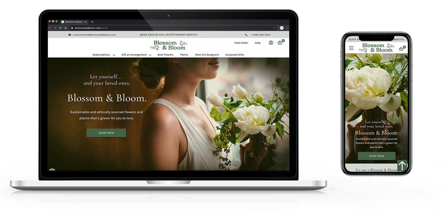
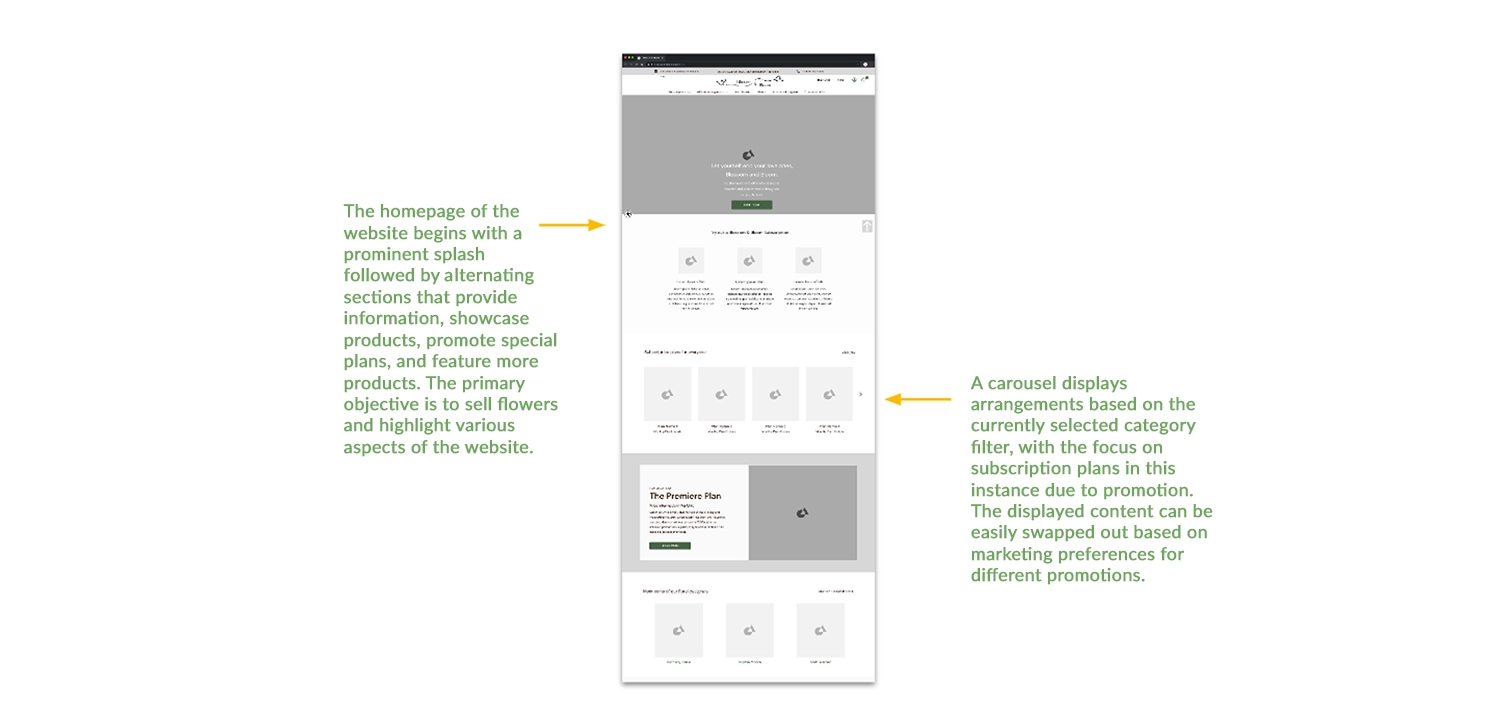
Homepage - After Usability Study
The homepage serves as a litmus test for the project's theme. The splash photo instantly establishes the mood of a more moody and serious floral website. To enhance contrast and alignment, I adjusted the header text and the 'Shop Now' button, considering the centered foreground image. Following the initial usability study, the focus shifted to streamlining clickability, ensuring hover animations and responsive interactions. Additionally, I increased the picture size of floral arrangements to provide users with better details.
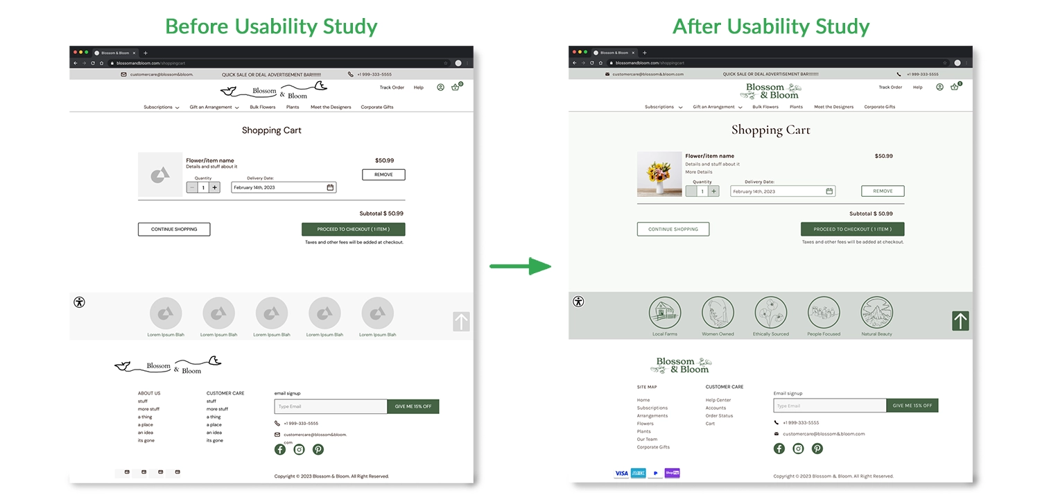
Shopping Cart - After Usability Study
One of the issues identified in the usability study was the "Quantity" number counter on the item page and shopping cart. Originally, users could set the counter to display 0, which was illogical for a feature reliant on user-specified quantities. This was promptly rectified across all pages using the counter. Additionally, I made minor formatting adjustments, aligning the remove button with other buttons and ensuring the price of items was properly aligned with the subtotal.
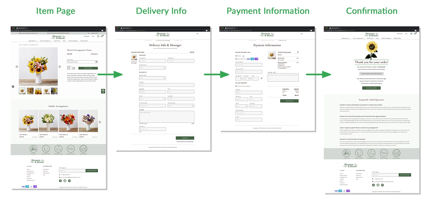
Checkout Process
The checkout process was a system I took pride in, as it closely aligns with user expectations during a checkout experience. Each data entry field is a component that switches to a filled state when clicked. This simulated user interaction, providing participants with a hands-on experience and guiding them in correctly reading and filling out the information. Post-usability study, I added a 'Thank you for your order' animation in the confirmation window. This enhancement drew users' attention to the details on the page and reinforced the successful completion of the action.
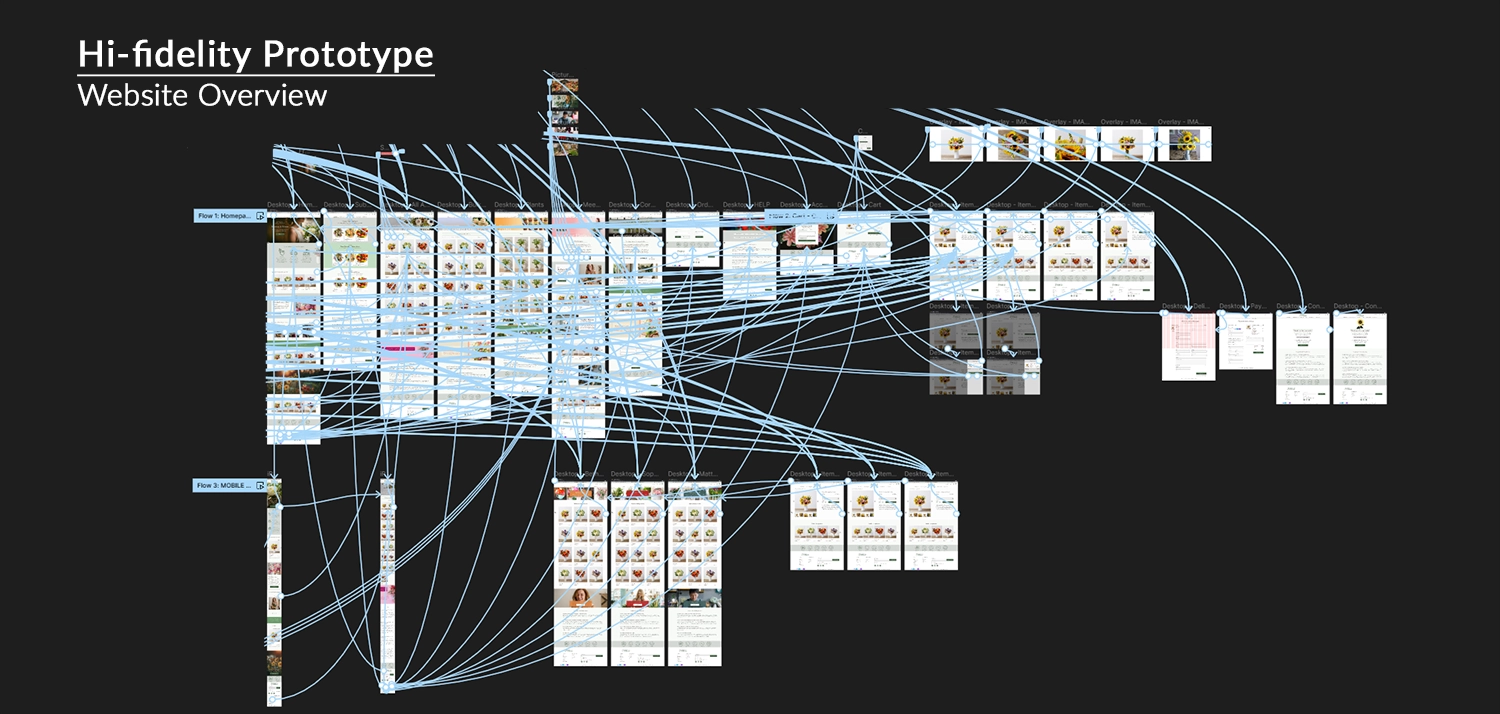
Figma Link: Blossom & Bloom Hi-Fi Prototype
Here is the updated overview of the entire Blossom & Bloom website, incorporating the Hi-Fi elements and adjustments based on usability testing. The overall flow through the website remains consistent, with the addition of more functional components like the picture gallery in the product pages. Additionally, two concept pages for the mobile version were designed, illustrating how the elements would scale on the home page and the main arrangement shopping page.
Impact and What I Learned
Blossom & Bloom is the project I feel most confident about both visually and functionally. Being a web and e-commerce project helped narrow the scope, providing focus and reducing unknowns. Conducting usability testing was also smoother, as participants were familiar with online shopping. With a well-defined sitemap and clear vision for each page, Blossom & Bloom feels like the most complete project in my portfolio. I also feel like I succeeded in my original goal of creating a floral website that while still delicate, definitely stands out at least among the websites that I audited. This would be very beneficial for the Blossom & Bloom brand.
In the future, I wouldn't mind using this project as a launchpad to test various components and processes, gauging user responses and exploring additional enhancements for the online shopping experience.
Thanks! You've made it through my entire design process,
Click the arrow button on the right to return to the top of the page, click Portfolio to see my selected works, or click Archives and look through other projects.