My Role:
- Design and Layout
Client:
- Bring Your Own Laptop
Year:
- 2020
About:
In early 2020, I decided to refresh my skills in Adobe InDesign, a software I hadn't utilized since my college days. Seeking a comprehensive refresher, I enrolled in a course offered by the Bring Your Own Laptop website. The culmination of the course was a final project centered around the creation of a prospectus for another course the website offered. The project provided a practical experience, involving the receipt of a detailed brief from the client, complete with specific specifications and a clear outline of the final deliverables expected for the project.
Challenges:
The most formidable hurdle for this project revolved around the design of the book cover. I found myself repeatedly revisiting and redesigning it. The primary issue stemmed from a dissatisfaction with the chosen style and the design not seamlessly harmonizing with the Bring Your Own Laptop theme.
WORK FLOW
| Receive Brief | Get specs and deliverable information from client. |
| Adobe Indesign | Layout, and design of prospectus. |
| Canva & Photoshop | Creation of a several mockups. |

Design Process
Scroll down to view the work flow process for the project.
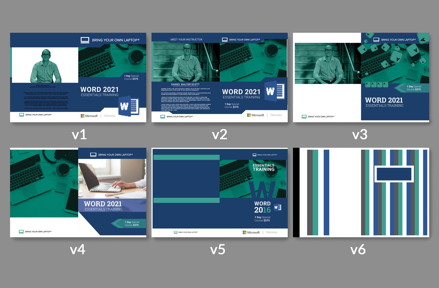
Designing the Cover:
Navigating the cover design for this project involved an iterative process, where I experimented with various concepts to discover the most fitting and visually compelling solution. My design thinking evolved as I adjusted elements, evident in the various versions of the prospectus cover:
Versions 1 and 2: Jigsaw Tab Shapes
The initial exploration involved using jigsaw tab shapes for visual interest, creating distinct blocks of color to highlight various assets. However, Version 2, while acceptable, veered towards a visual style reminiscent of early 2000's textbooks.
Version 3: Keyboard Keys
Building on the laptop imagery, Version 3 incorporated the concept of keys flying off a keyboard. However, despite initial exploration, this idea was eventually discarded as it also conveyed a sense suggestive of an old textbook.
Version 4: Stock Photo Integration
In Version 4, I replaced the green picture with a personally chosen stock photo to brighten the cover. Additionally, I opted to simplify the elements into boxes or triangles. While this represented an improvement, it was considered somewhat lacking in energy.
Version 5: Cutout "W"
In an attempt to infuse more interest, Version 5 experimented with cutting out the 'W' (from Microsoft Word) from the cover image and left-aligning all the text in a right column. While I appreciated the 'W' cutout, the design became off-balance.
Version 6: Composition Notebook Aesthetic
After spending hours redesigning the same cover, I felt the need for a palette cleanser and decided to make a radical shift. Version 6 drew inspiration from the lined color column aesthetic of old-school composition notebooks. While it presented a cool pattern, it obviously left no room for textual elements.
Throughout these iterations, the design process unfolded as a series of refinements and experiments, with each version contributing valuable insights. The final decision for the cover design was informed by this iterative journey, ensuring that the chosen direction aligned with my vision for the project. This showcase of various covers not only illustrates the evolution of design concepts but also underscores the critical thinking involved in arriving at the most effective and visually impactful solution.
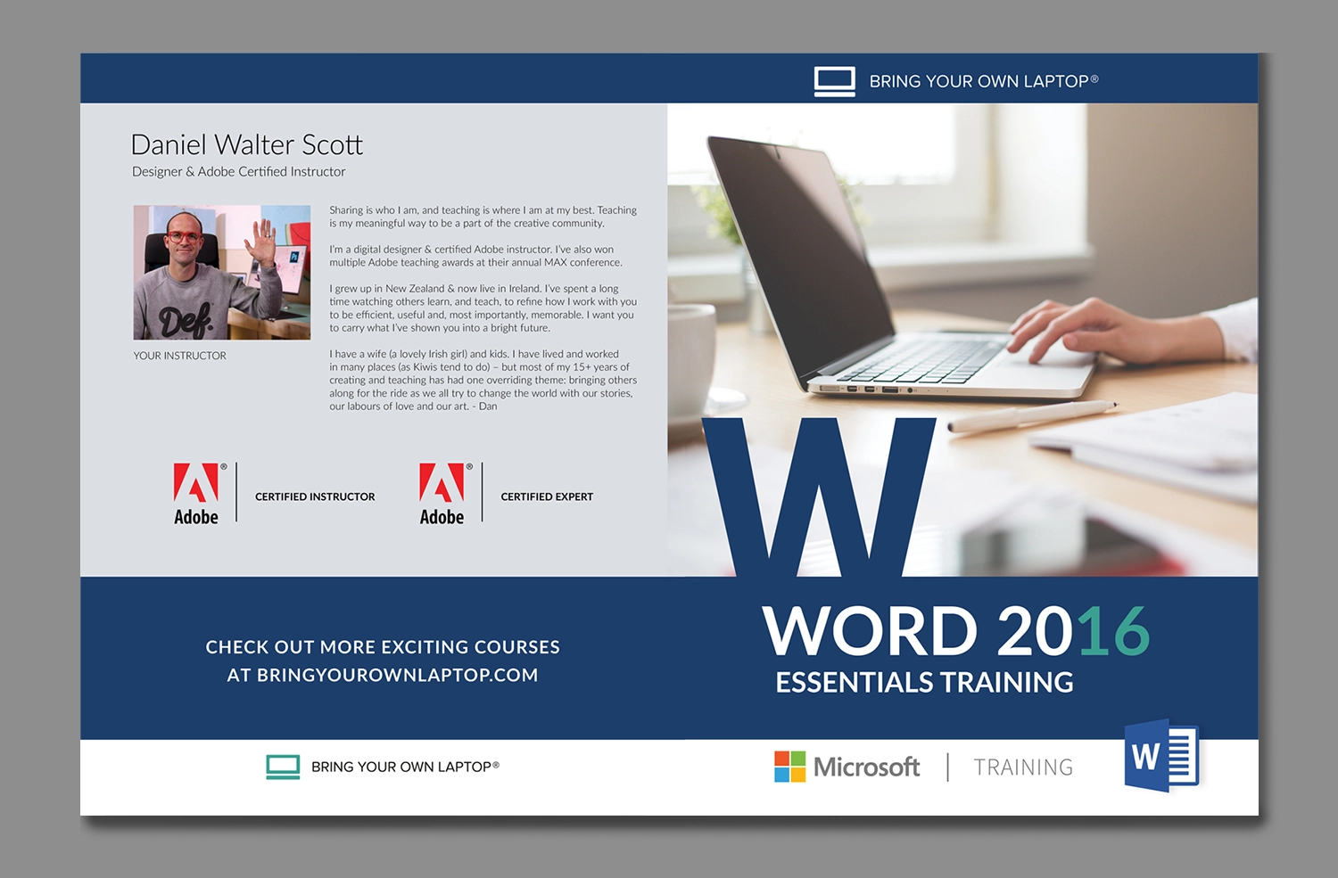
Final Cover:
In the final iteration, I combined elements from various previous versions to craft a cohesive and visually appealing prospectus cover. Here's a description of the chosen aspects:
Color Photo: I opted for the color stock photo over the green-tinged image, it made it much easier to visually balance with the other colors. The addition of a neutral gray for the back cover helped balance the color from front to back.
Simple Design: I retained the use of solid blocks of blue, representing MS Word's official color, while incorporating white at the bottom to enhance contrast and ensure readability of color logos.
Decorative Cutout: The decorative big "W" cutout from Version 5 was integrated into the final design. This element adds a touch of uniqueness and visual interest without introducing unnecessary clutter, contributing to a clean and modern overall appearance.
By picking and bringing in these design elements, the final cover achieves a seamless mix of color, contrast, and unique features that align with the envisioned theme for the prospectus. This iterative approach really helped us nail down what elements clicked for the final cover.
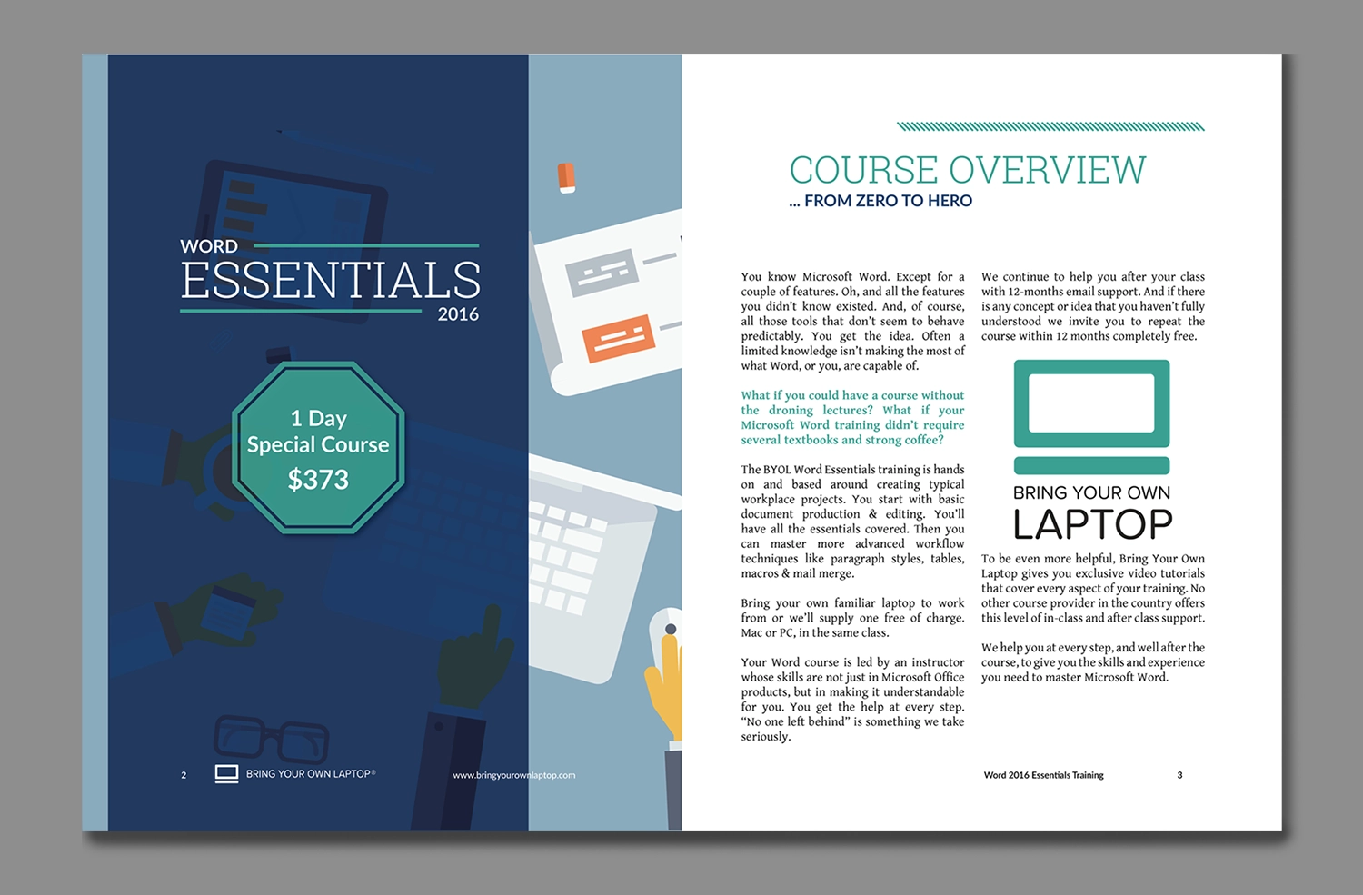
First Spread:
This was the first spread I designed for the prospectus. Page 1 serves as a splash page, introducing some visual interest along with the course title and the associated costs for the course. Page 2 starts with the course overview. There wasn't alot of text that needed to be included for this prospectus so I went with a straightforward 2 column layout. I kept the color palette cohesive with the prospectus cover, featuring white, blue and the BYOL green color. Formatting was a seamless process and I only had to make minimal spacing adjustments to help with rivers from the justified text.
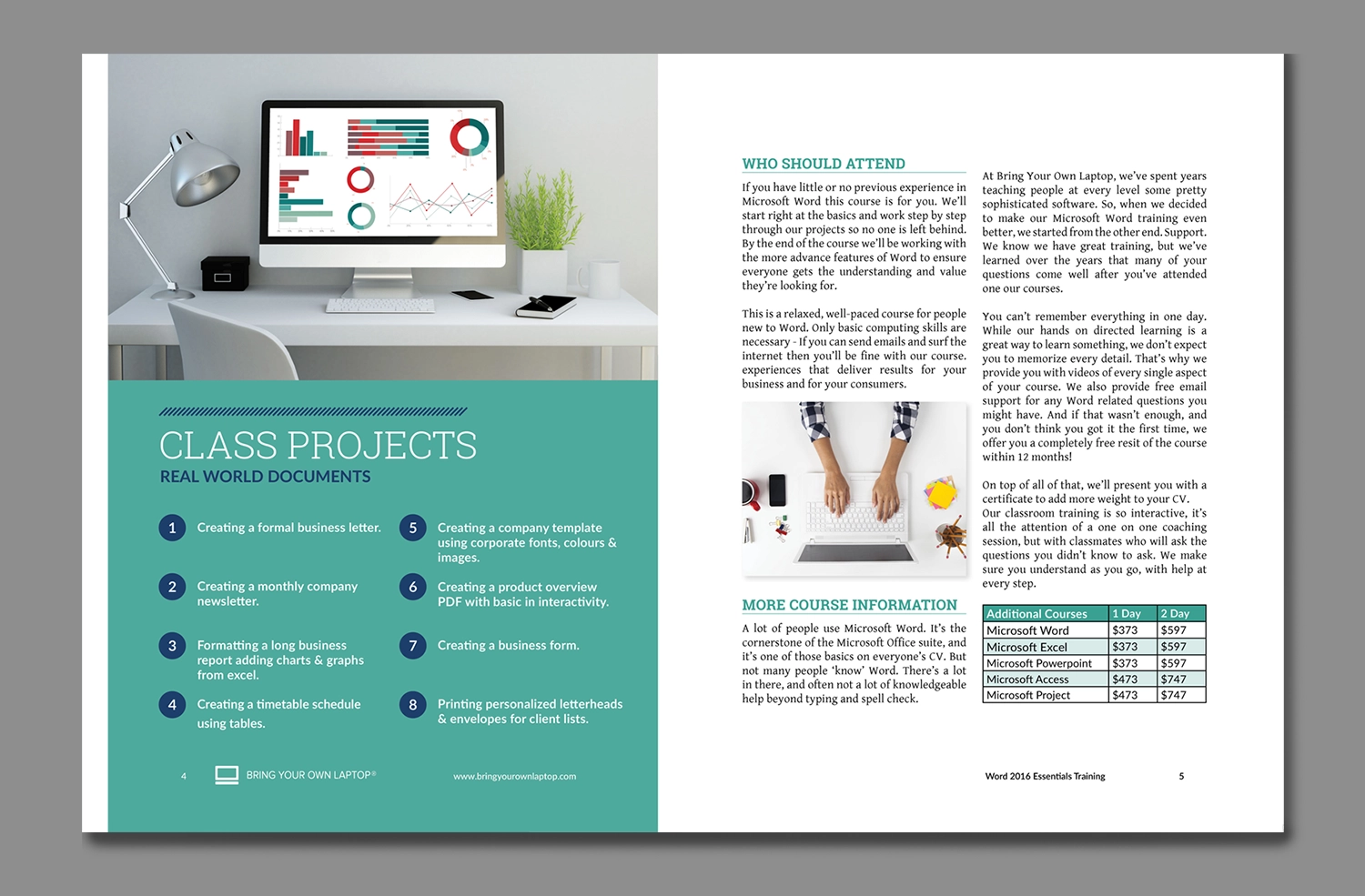
Second Spread:
Here was the second spread within the prospectus and contained the class projects and additional information. I recognized that the listed class projects was the most interesting information for prospective students so I highlighted it by containing it on its own page. This took some time to align and format but, the end result looked well-balanced. The final page of the prospectus contained the rest of the information, it needed to have an embedded image and an information table. This was also a fairly easy alignment process and I was able to find a position and margin that allowed the text to wrap around these items with minimal issues.
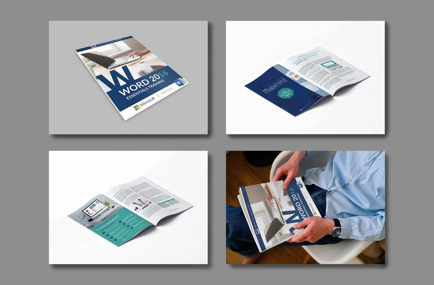
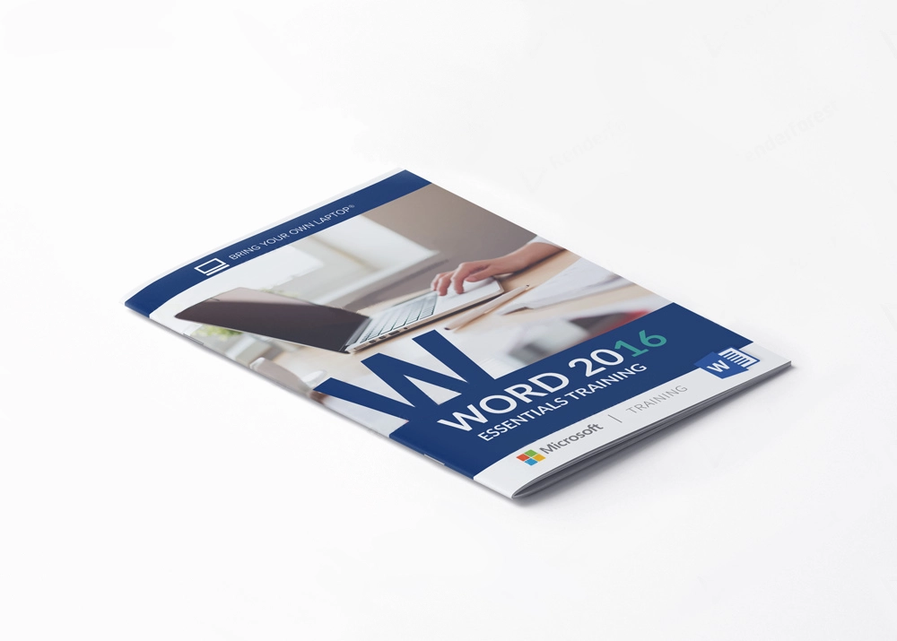
Prospectus Mockup:
The course delved into the effective use of mockups, a practice which had evolved significantly since my collage days. In the past, your final version of a project was printed and mounted on display board. However, with the advancement in mockup generators and the distort and warp tools in Photoshop, designers now have a more streamlined method to digitally showcase printed works for clients.
I find these mockups highly beneficial. It not only enables designers to present a visual representation of the final project without the need for test prints, saving both time and resources when pitching ideas back and forth with a client. Ultimately, these mockups aid in creating a more compelling proposal and contributes to the successful promotion and sale of the product.
Thanks! You've made it through my entire design process,
Click the arrow button on the right to return to the top of the page, click Portfolio to see my selected works, or click Archives and look through other projects.