My Role:
- Design of Work
- Digital Painting
Client:
- Private Married Couple
Year:
- 2022
About:
I selected this project as a recent example of my digital painting skills, which I resumed working on in 2021. This commission was requested by a married couple. The wife wanted a painting that could thematically match two other paintings she already owned for a triptych-style display in their bedroom. I was given pretty much free rein to paint whatever I chose, as long as it thematically matched the existing paintings and was sized similarly to the smaller Link painting shown below.
Challenges:
The only initial challenge was deciding what to paint. It had to be thematically similar, but the Zelda franchise is vast. I knew from the beginning that Zelda would likely be a focus to pair with Link, especially since the commission was mostly for the client's wife. The only other challenge arose in the time spent painting. I really enjoy photorealistic-style artwork and relish the challenge of getting lost in small details. However, this piece took quite a number of hours, and I started experiencing Ulnar Tunnel Syndrome. As a result, I needed to adjust the amount of time spent painting without breaks.
WORK FLOW
| Photoshop | All the painting was done in Photoshop. |

Design Process
Scroll down to view the work flow process for the project.
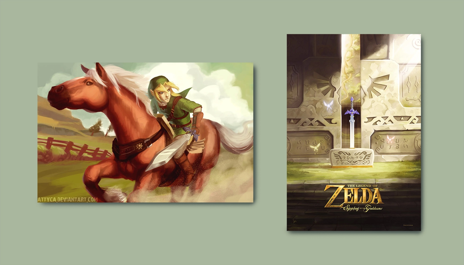
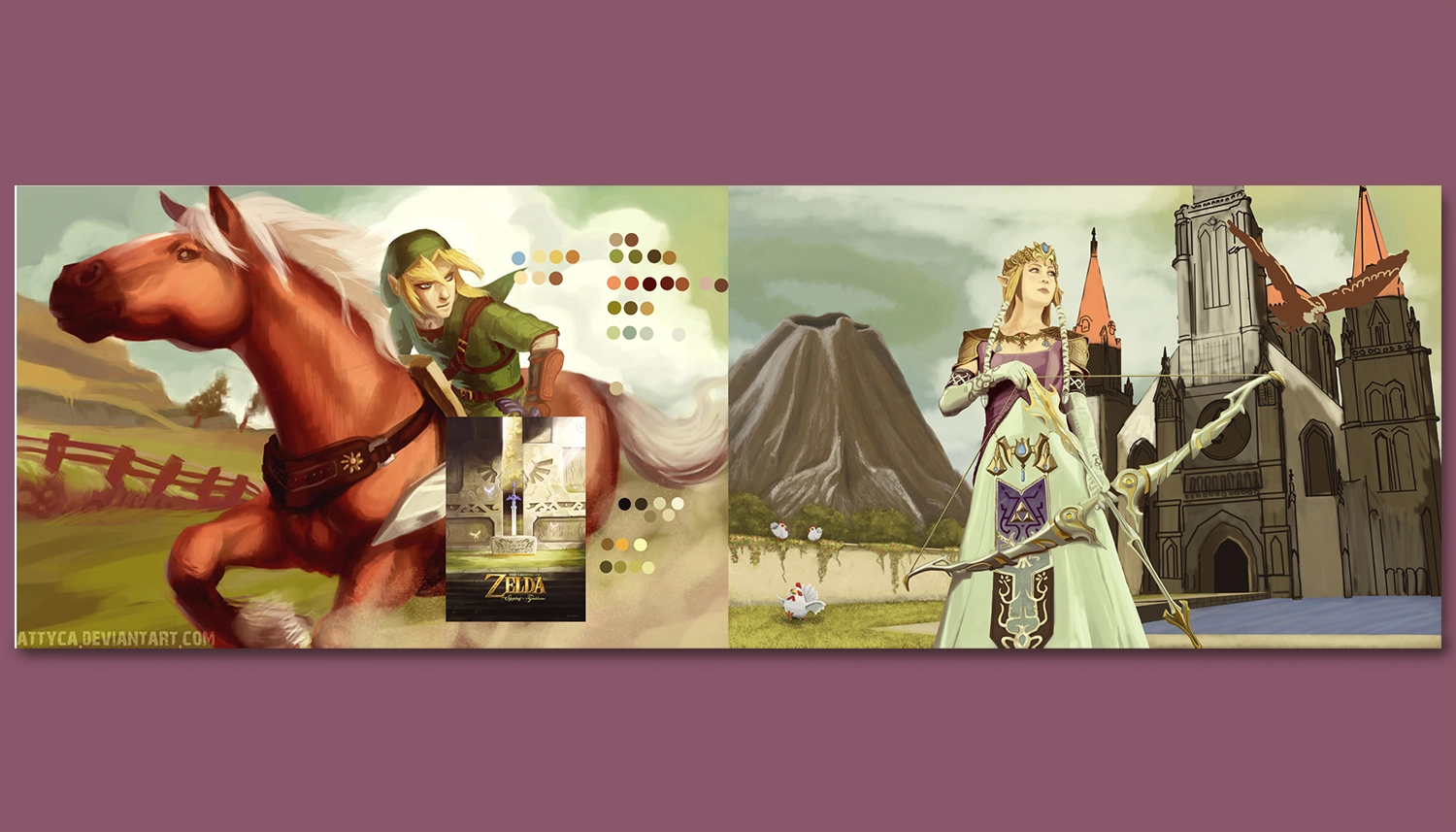
Matching Existing Paintings:
These two paintings were already owned by the client and were intended to be displayed alongside the work I would be creating. The painting of Link on the left was a definite choice for display, and they also considered that the poster on the right could be used if they all worked well together.
My main focus then became twofold. Firstly, ensuring that my painting thematically matched, and secondly, making sure that color-wise they complemented each other. Matching the color was a straightforward process as I could derive my initial color palette from the existing colors in the two reference paintings. However, finding a subject matter was a bit of a process, given the vastness of the Zelda IP with numerous characters and different versions to choose from.
Painting Layout:
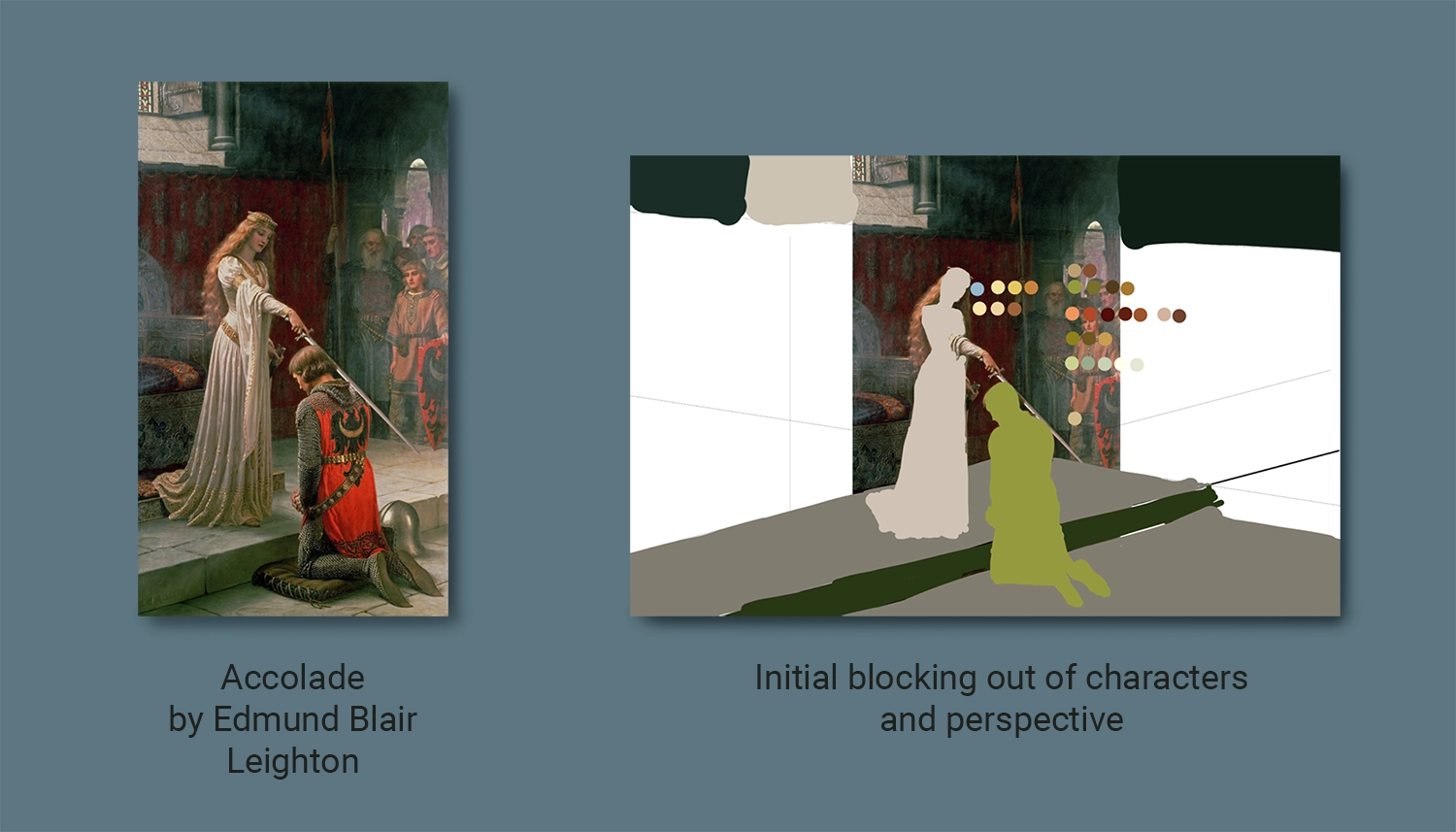
The first step in my process is getting the layout and perspective of the scene and also starting to block out characters into separate painting layers. Unfortunately, I didn't save this process for the final painting. However, here's a very early blocking out and perspective for a scene that I was initially thinking about painting based on a famous painting, 'Accolade' by Edmund Blair Leighton. I liked the relation of the Lady and the Knight and pictured Zelda and Link in the scene but expanded it into a horizontal composition to better match the other painting the client had. You can also see the color swatches that I had already picked out from the reference paintings.
I ended up not going with this scene because after researching it a bit and exploring other Zelda fanart, I found quite a number of people that had already used the scene. Instead, I wanted to produce something more original. In the end, my reference material consisted of a collage of screenshots from the game and photographs of cosplayers.
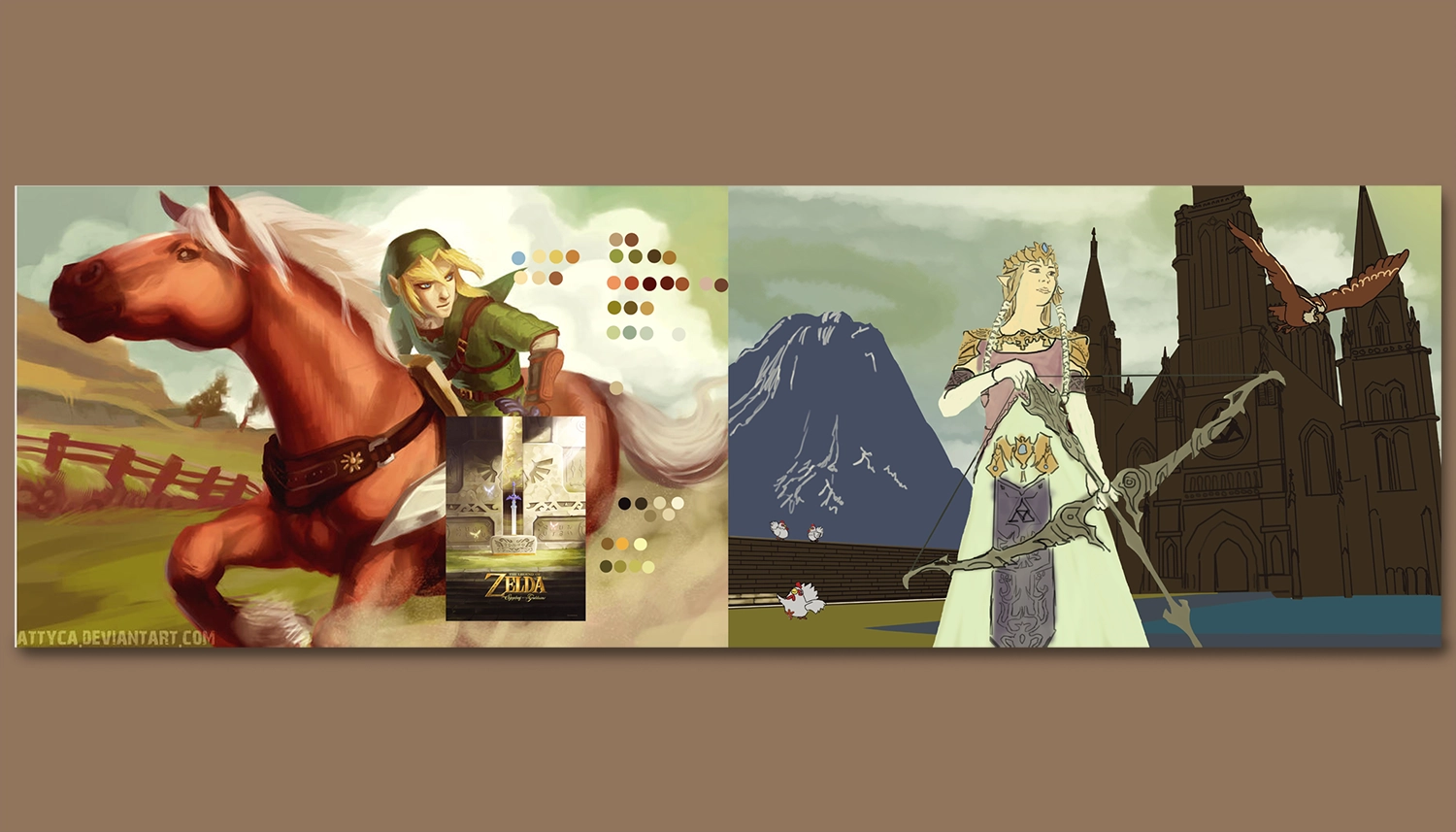
First Export - After Color Blocking:
This was the first export that I saved during the process of painting this piece. It also demonstrates how I had set up my canvas in Photoshop for this painting. I created a file that was double the length of the painting to accommodate the reference painting, poster, and color palette swatches on one side of my screen, and the painting I was working on the other. This allowed me to quickly move back and forth and use colors from the referenced materials.
At this stage, I've blocked out all the main shapes, which consisted of Zelda, the Temple of Time, the lawn and wall, the water, Death Mountain, and the sky. I started painting some initial colors from the color palette. It's funny looking back; I realize I got the sky done so quickly compared to many other parts of the painting.
What I enjoy most about digital painting is that, once you block out your major shapes into a layer, you have so much control in the process of gradually adding shadows and highlights onto a layer using clipping masks.
Second Export - Character and Left Side Mostly Completed:
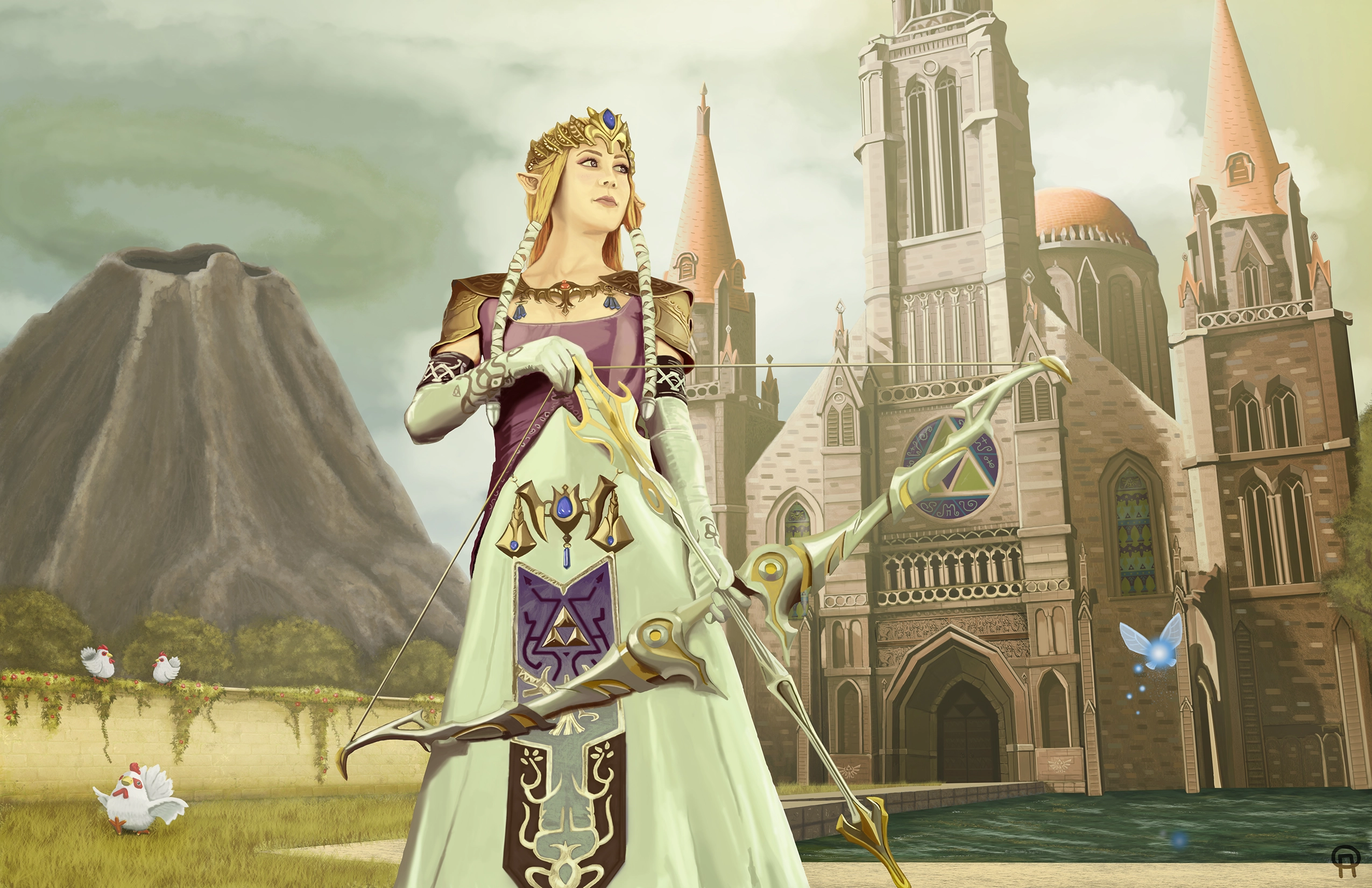
Here's another export I created after mostly finishing Zelda and the left side of the painting and had started working on the Temple of Time. I spent a ton of time detailing Zelda's clothes and the bow and knew I was also going to go crazy on detailing the Temple, so I took a break for a few days at this point. It also helped to get some fresh eyes on the project, where I decided to get rid of the Owl character because it was visually too much and instead placed Navi, the fairy, over the water.
Looking at it now, I still appreciate the shading on the dress, which gives it a satin feel, along with the shading and details in Zelda's shoulder pads and bow. At this point, the client really loved the Cuccos and the little flowers on the left wall, as they were cool hidden details more visible in the larger image.
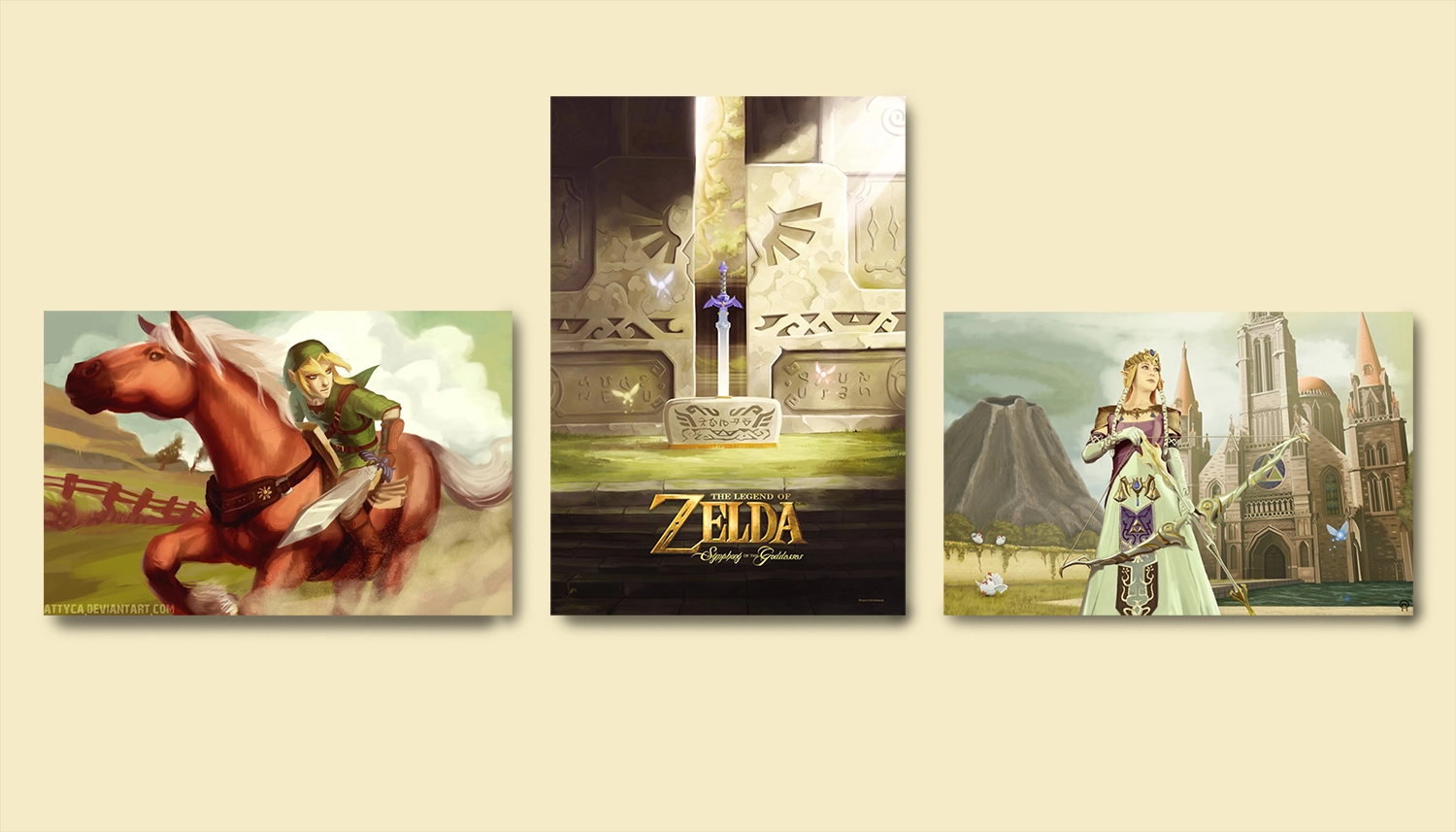
Triptych Mockup:
In order to show the final result that the client would have for display, here's a quick mockup with the other two posters in the triptych format that they would be displaying on their bedroom wall. This was a fun commission to do, I had the painting printed and framed and they enjoyed my painting enough that now they're thinking of commissioning me to paint another of Link as well.
Thanks! You've made it through my entire design process,
Click the arrow button on the right to return to the top of the page, click Portfolio to see my selected works, or click Archives and look through other projects.