Archives > Paintings and Illustrations > Ann Rand Two-Toned
Ann Rand Two-Toned
Ink Illustration | 2012
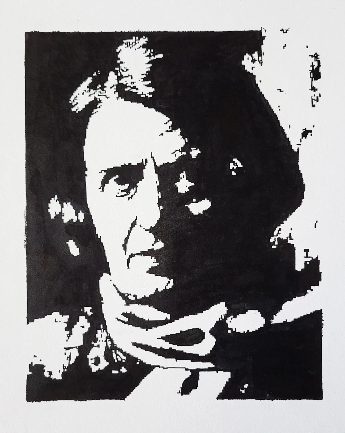
This school project was part of a series of high contrast ink drawings, and I chose to create a portrait of Ayn Rand for two specific reasons. Firstly, I had just finished reading Atlas Shrugged, so she was fresh in my mind. Secondly, I found her face intriguing and believed it would lend itself well to a dramatic high contrast composition. Instead of using high-resolution references, I intentionally selected a low-resolution image and scaled it up, resulting in a pixelated effect in the linework. Although it was challenging to draw, this added an interesting visual element to both the process and the final piece.
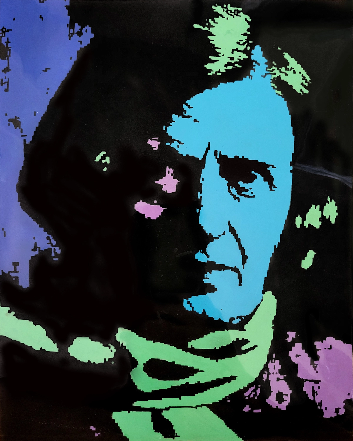
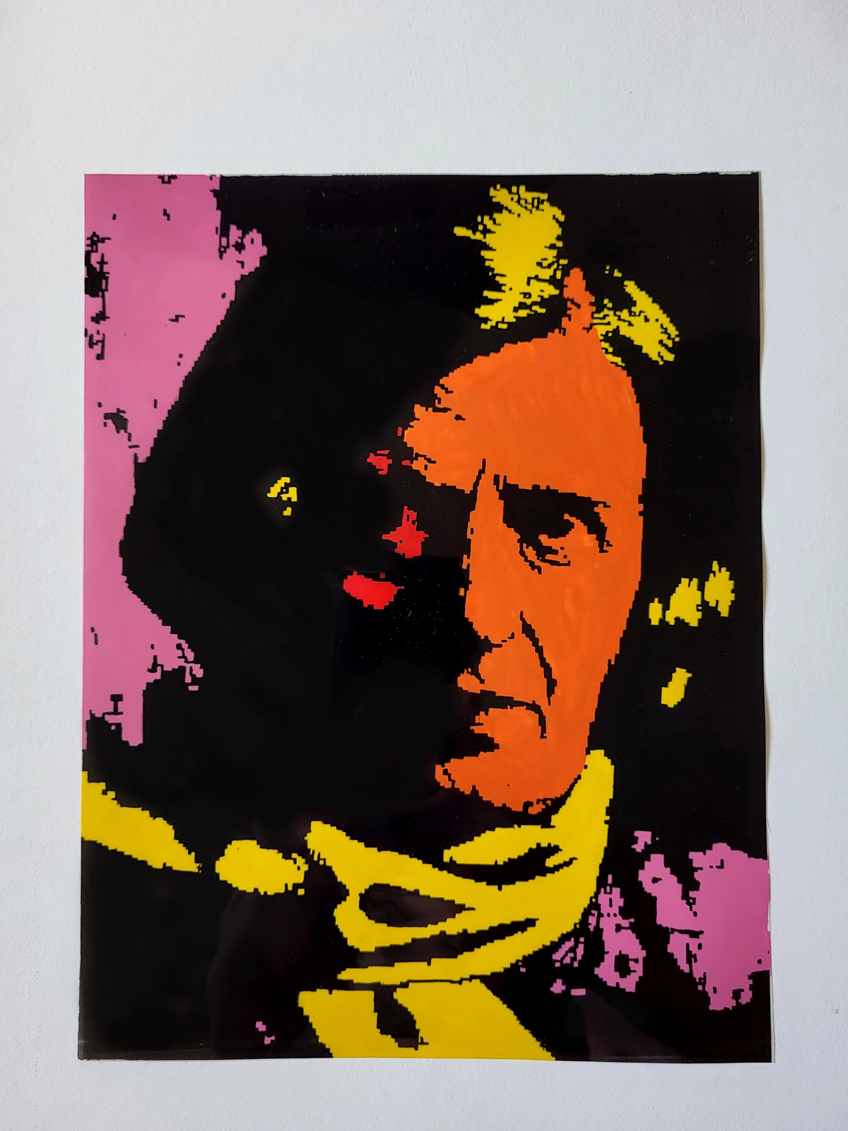
To further explore color palettes, I transferred these high contrast drawings onto overhead projector paper and experimented with acrylic paints on the back of the transparency paper. Eventually, I settled on a cool blue tone and a warm orange tone, creating distinct color schemes for the artwork.
Then the warm toned colors on a overhead projector sheet.
The the cool toned colors on a overhead projector sheet.